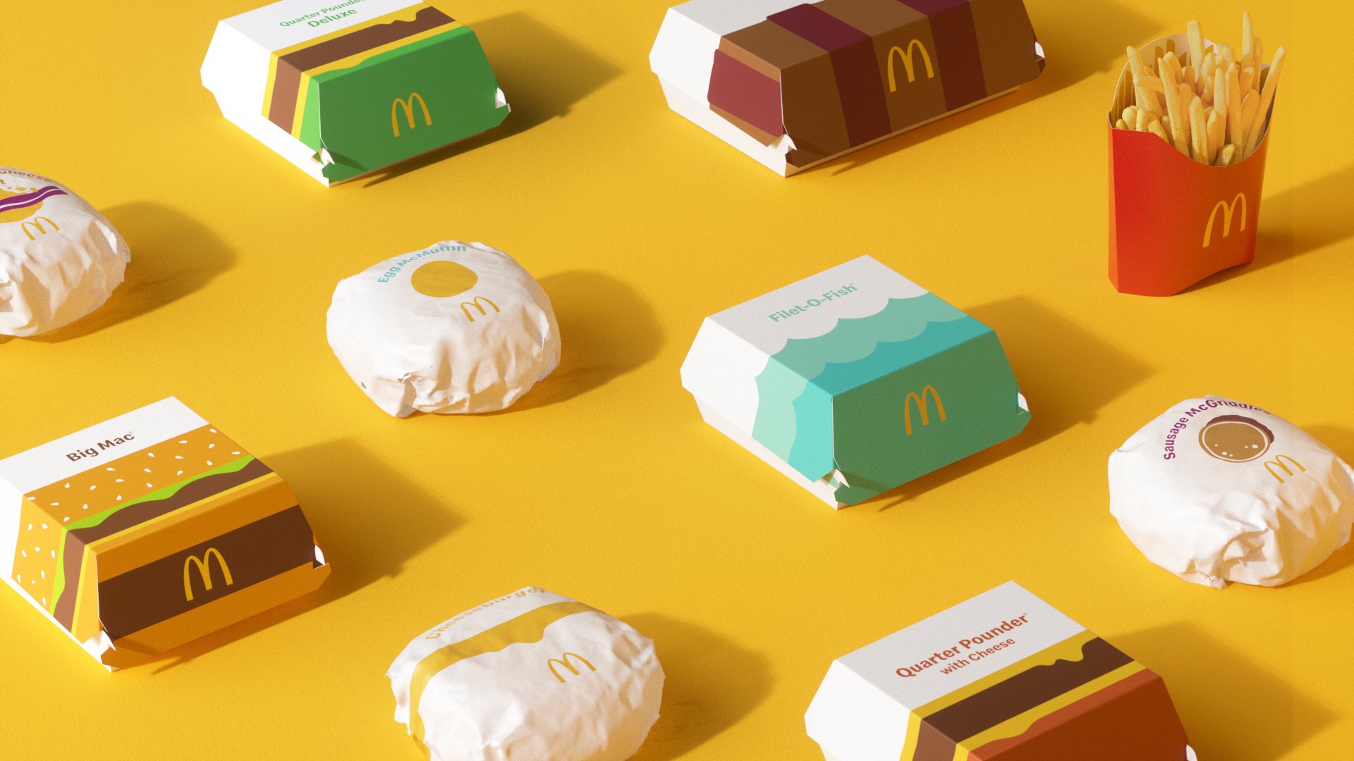
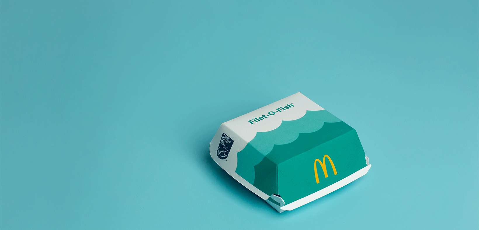
A new look for a lasting legacy. We partnered with McDonald’s on a multi-year effort to redesign their global packaging system. The renewed design brings a sense of joy and ease to the brand through bold graphics. Placing McDonald’s playful point-of-view front and center, we evolved the brand’s design system away from prominent on-pack messaging, cooking up graphic representations of their iconic menu items instead. From the cool blue waves on the Filet-O-Fish® clamshell to the golden, melting cheese on the Quarter Pounder® with Cheese, the packaging makes for an expressive, visual system. Each wrapper, clamshell and pack is identifiable, joyful and simple. With evocative, easy-to-understand graphics, McDonald’s’ new packaging is recognizable regardless of where in the world orders are being assembled, shared and enjoyed.
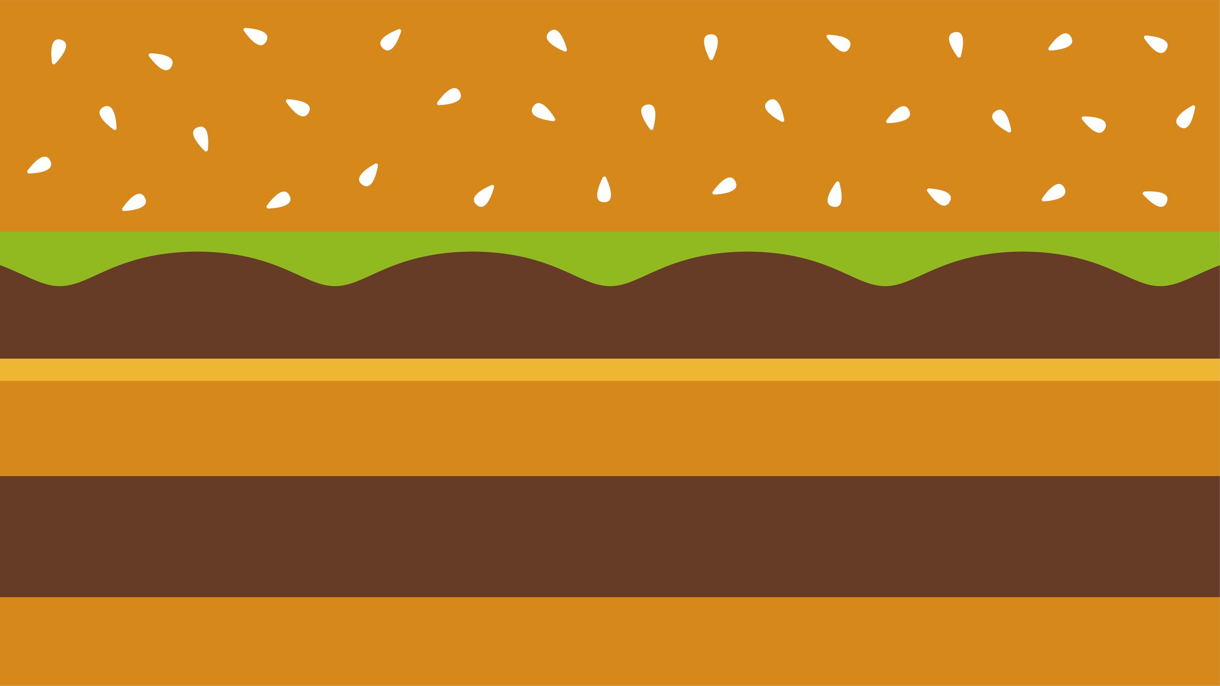
Our visual system was designed to be recognized by either the iconic food builds like the classic Big Mac®, or by an emotional link such as our
Filet-O-Fish® waves.
Our visual system had to solve for three goals: unite the McDonald’s portfolio with a cohesively branded aesthetic globally across multiple languages and cultures; bring smiles to our consumers through our visual language and graphics while staying authentic to the brand; only continue to improve crew navigation behind the scenes in every McDonald’s kitchen.

With evocative, easy-to-understand graphics, McDonald’s’ new packaging is recognizable regardless of where in the world orders are being assembled, shared and enjoyed.
The Quarter Pounder® is a perfect example of how we showcase a sandwich build paired with a vibrant color system that flexes for various offerings to allow easy recognition for both consumer and crew.
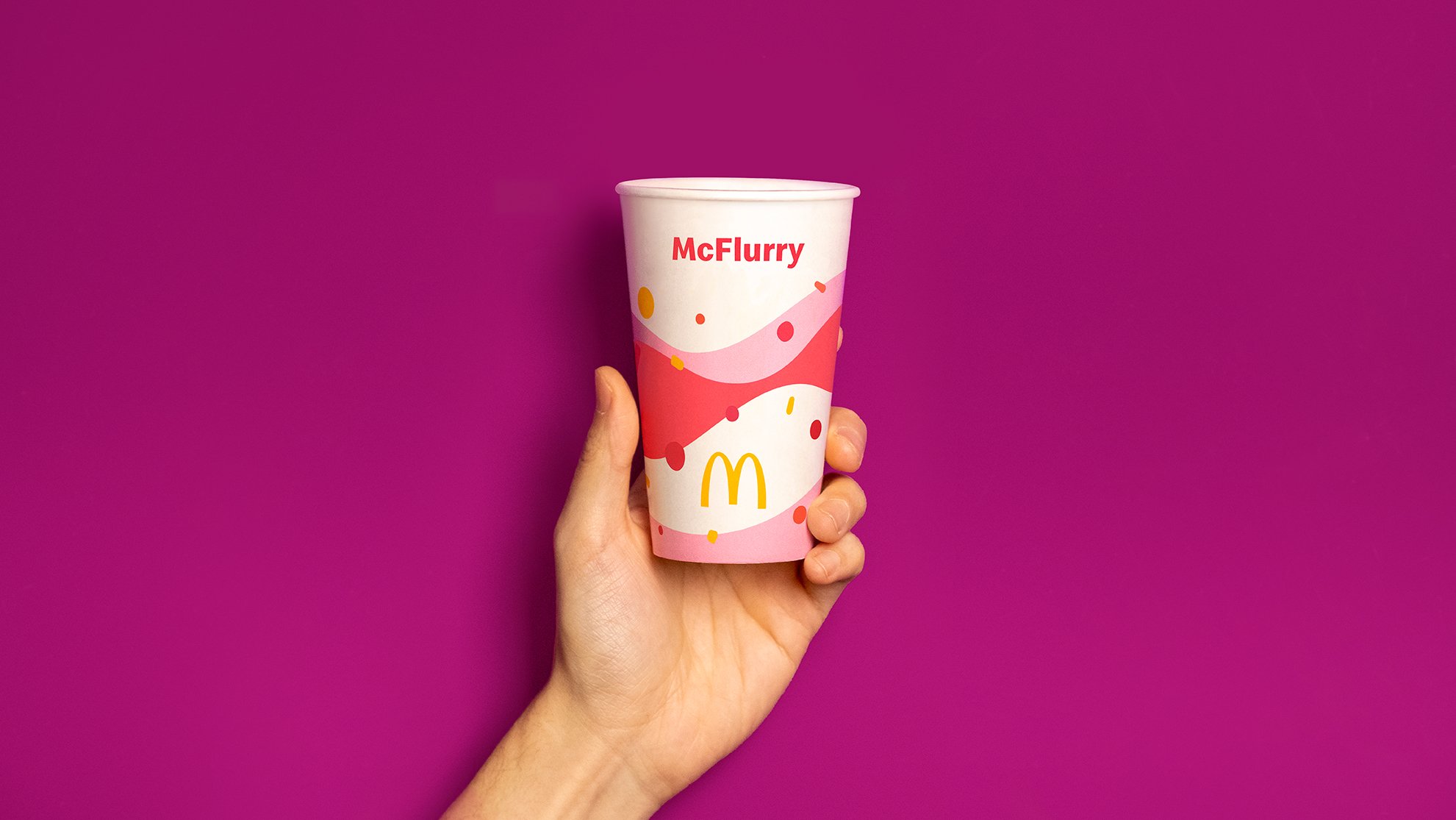
A playful swirl of joy for our new McFlurry expression helps showcase how our simple everyday moments can come to life across the multiple tiers and product offerings.
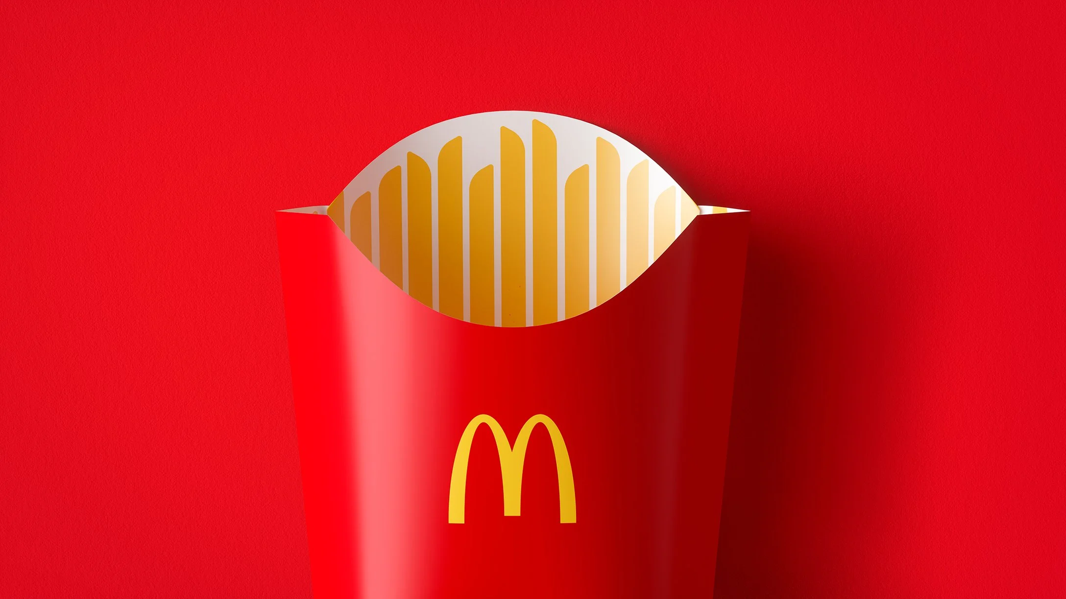
Creating thoughtful winks that bring a smile, we took the opportunity to replace the traditionally functional and boring yellow pinstripes with illustrated fries that provided the same job.

Simple joyful moments extended to unique offerings from various parts of the world, limited edition offerings or partnerships, and of course—seasonal treats.

The end result of our redesign is a perfectly imperfect visual system that brings smiles to millions of people everyday.
Awards Won
Pentawards
(Bronze Award 2021 — Food)
Transform Awards North America
(Gold — Best Use of Packaging), (Silver – Best Creative Strategy)
PAC Global Awards Brand Marketing
(2022 Best in Class)
Client: McDonald's Corporation
Studio: Pearlfisher NYC
My Role: Designer
Studio Team: Hamish Campbell (VP Executive Creative Director), Matt Sia (Creative Director), Priyanka Krishnamohan (Design Director),
Alex Wagner (Senior Designer), Tiffany Bacani (Senior Designer) Nadia Izazi (Designer), Shruti Shyam (Designer), Alyssa Cohen (Freelance Designer),
Justine Allan (Head of Client Management), Courtney Tight (Client Director), Teri Neis (Client Manager), Brandi Parker (Head of Realization),
Stephen Kwartler (Realization Manager), Mat Brown (Senior Visualizer)